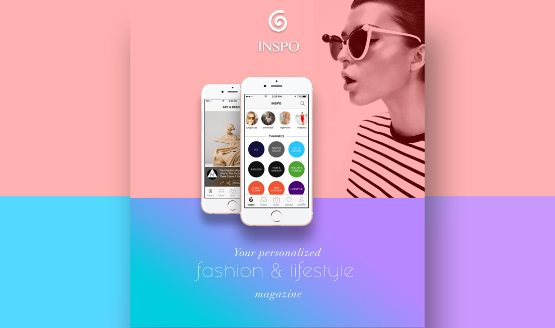
inspo
In 2015, I co-founded Inspo: a fashion & lifestyle discovery app, focused on personalized content and experience.
This is our story:
To comply with my confidentiality agreement I have omitted and appropriated confidential information.

my role
Because of my previous experience in the fashion industry, and my in-depth knowledge of our target market, I managed Inspo's marketing research and strategy. Moreover, I was closely involved in the entire product design and development cycle; and subsequently, I was responsible for user research, mental models, project design, design and experience strategy, wire-frames, beta testing and feedback collection.
I worked alongside the founder, who focused on back-end development; and , together, we managed a small team of remote front end developers.
Tools: Photoshop, Keynote, Google Analytics
the challenge
We had two primary objectives:
- Personalized UX: To enhance the user experience by actively addressing pain points, and providing personalized content.
This included testing features and functionalities to identify which were essential, and which trivial. - Pleasurability: To create a product that went beyond functionality; A pleasurable product that attracts a loyal user-base and grows organically.
Our main challenge as a startup was to establish an agile workflow that would allow us to:
- Develop a minimum viable product quickly and economically
- Test with real users
- Rapidly iterate
- Repeat
the approach
Although we initially decided to develop better functionality than our competitors, we realized that engaging in a feature parity war was a weak strategy.
To differentiate ourselves in a mature and competitive market, we needed to define a desirable role for the app and how it would meet the needs of our users.

Keep it collaborative; keep it lean.
We decided that a lean approach was the most efficient way to design and develop Inspo. This process emphasized on rapid sketching, design mock-ups, low fidelity prototyping, development and user feedback.
the discovery
During this phase, we defined project milestones, reviewed the competitor landscape and began research into user needs, behaviors and pain‐points. We also performed technical research to understand feasibility and constraints.
Our research revealed that affluent women, especially 25-35 are the dominant demographic in online and mobile shopping. They also make up the largest user demographic of competitor apps, such as Instagram and Pinterest. We used these findings to create our personas and user journeys.
After designating persona types and aligning this with our phasing strategy, we were able to prioritize whom we would be focusing on supporting in the early stages.
We used personas throughout the project to help us design around the user and not get lost in our biased outlook.
Our persona hypothesis consisted of four different archetypes, which we used in order to discuss our users needs, desires and contexts of use. Then, we identified our user segments by variables, such as gender, frequency of use, motivation to use and categories of interest.
User Empathy
Due to limited resources, we needed to be efficient in conducting user research, and collecting feedback. Luckily, it was easy to find avid fashion and lifestyle enthusiasts in Los Angeles! We conducted a range of interviews with co‐workers, friends and even strangers. We then studied reports on competitors to understand users motivations for using similar apps. These varied research techniques helped to quickly gain insights into the needs of our users.
Visualizing A-Z
We used user journeys to visualize the users end‐to‐end experience across various touch‐points. This allowed us to represent user pain‐points and see where we needed to focus our attention.
the vision
-May the Best Content Win!-
Superior experience for trendsetters and enthusiasts
Our vision was to help users have a more personalized and pleasurable experience than they did from our competitors. We wanted to become a user curated fashion & lifestyle "magazine".
Our main priority for the early phases was to focus on primary user goals. So we opted to design a minimum viable product, focused on usability and convenience.
Power to the content
We envisioned empowering enthusiasts, who didn't have the luxury of a huge following on other platforms to get their original content out there and seen. We wanted to design a democratic platform, in which the users actively curated the content; a platform in which the best content won!
the requirements
Designing for what users want to see, do & feel
Incorporating goals from our research helped us consider not only what the app should do, but also how it should feel. We believed this was key to creating a great experience.
Storytelling for Ideal Experiences
Knowing who exactly we were designing for helped us imagine how the app fits into the lives of the users. We imagined ideal experiences and focused on how our personas think and behave. Keeping the scenarios at a high‐level helped us work smoothly, and shaped the basis for our requirements.
Using Mental Models
We came up with a set of tasks that users do, when using discovery and shopping apps. We categorized and segmented the tasks into behavioral subgroups, and aligned them to content and features. This also helped us to visualize what existing functionality and content would be useful, what tasks needed supporting, and what opportunities were available to innovate.
Then, we made a spreadsheet to prioritize them according to our personas' needs, tech feasibility and business objectives. We used this data for our phasing strategy, the product feature road-map and the product backlog.
Brand and Experience Requirements
By understanding the usage contexts of the app, we had a clear vision for what our brand should look and sound like. We developed a set of experience principles to communicate the personality of our app to our team, make better design decisions, and express core values and attributes that the app experience should uphold. We used these principles constantly to drive the aesthetic, feel and overall direction of the app.
the framework
Setting the Design Direction
We took a top‐down approach to defining the overall structure of the experience. We generated several ideas for arranging our UI, information architecture, functional and data elements, and interactive behaviors.
Structuring the experience
We defined the primary pathways our personas would explore through the app and made several key user journeys for each of our personas to conceptualize, and structure the content and functionality. We considered particular usage contexts, the opportunities they present and how elements manifesting themselves in the interface would elevate the UX.
Interaction Framework
We used Keynote to prototype and test the app's interactions and transitions, since it offers all the native iOS transitions.
We opted for subtle and standard transitions to make the experience as fluid, intuitive and familiar as possible.
detailed design
Introducing inspo
The gallery below shows the final iOS app
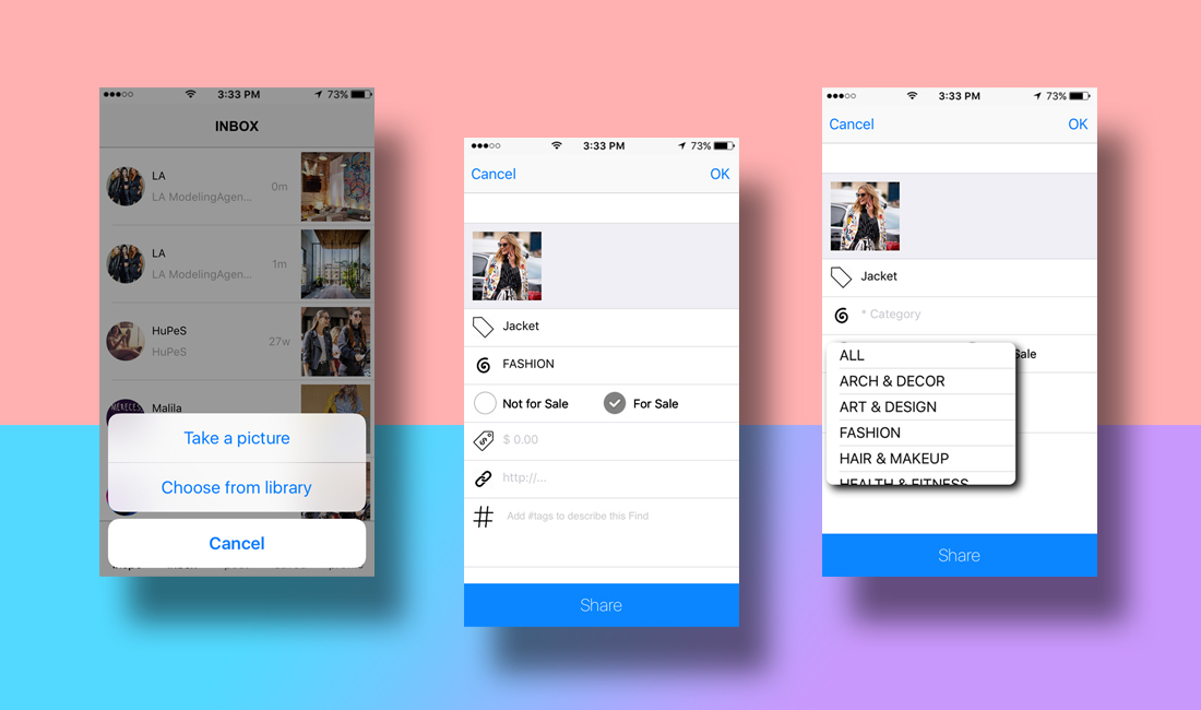
Make it intuitive
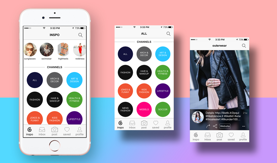
Main Page
We designed the main screen to minimize learning for the user, and immediately put them at the heart of the experience. We showcased main "channels", which are categorized content streams, so new users can immediately start exploring, and learn to use the app effortlessly.
Navigation
We also chose to have a tab bar for navigation, to make it easier for users to get a clear understanding of the scope of our app. This was a good design decision, due to the minimalist nature of our UI and low number of navigation options.
Designed for Confidence
The interface design strived to be clean and confident to let the content shine. We opted for clear, readable typography; and we chose colors with high contrast to increase legibility. The design is uncluttered, clean, large and well spaced. All our design decisions help to exude a sense of chic confidence in the product.
the refinement
Testing With Users
We tested the product with real users, by:
- Conducting in person interviews and observing how they use the app, monitoring bugs/crashes, and getting immediate verbal and nonverbal feedback from our users.
- Monitoring and analyzing real time user behavior data, from users in different geographic areas via Google Analytics.
Between the times spent recovering from bugs and app crashes we were able to find usability issues with bookmarks and sharing content.
Adding trending channels
We added the row of "trending channels" to the main page, on top of permanent channels. These channels were updated periodically and severed as a way to:
- Highlight trending or promotional content
- Motivate users to return to the app more often
- Perform AB testing on new content and features

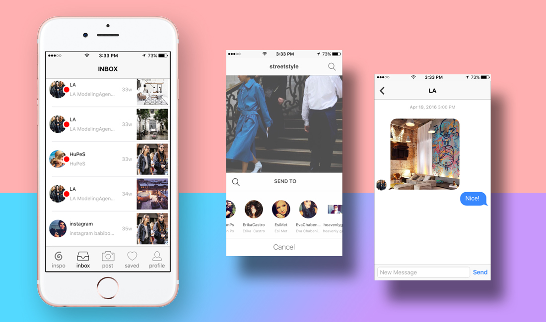
adding messaging
Long before Instagram added messaging, we realized that the ability to send content privately would enhance the user experience, and address one of the major user pain points.

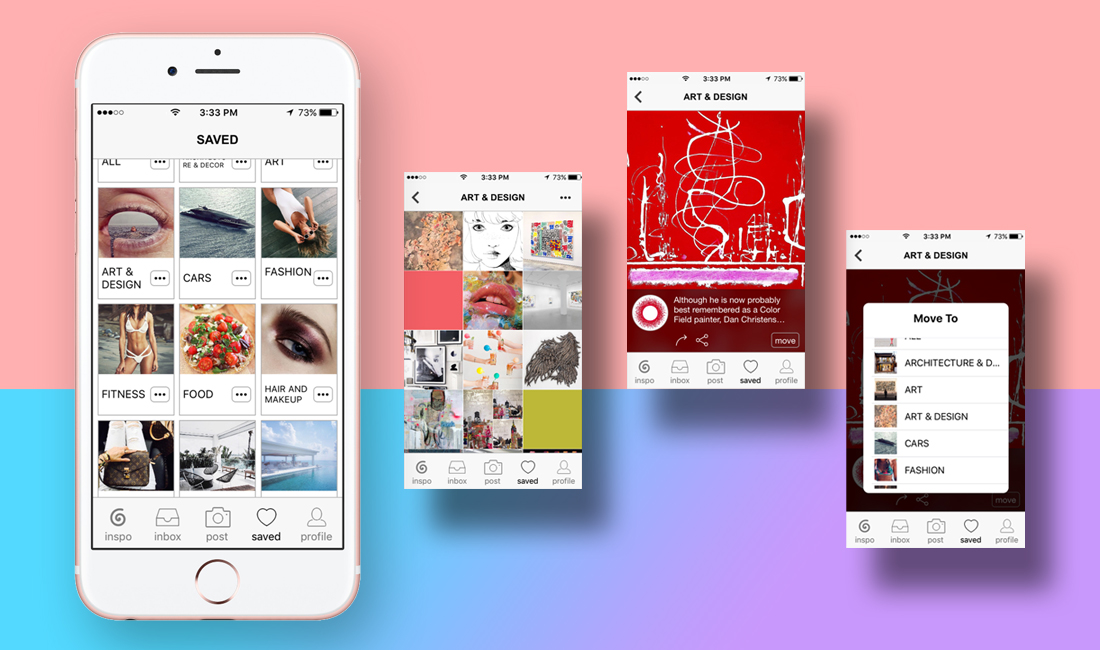
changing bookmarks
We had originally designed this page to save all content, liked by the users; and we gave them the ability to create folders and organize them. However, after analyzing user behavior data, we realized that our users rarely used this page. Therefore, we changed its UI and started to automatically save each liked picture in a folder, according to its category. We still gave users the ability to create or delete folders, and move content from one folder to another. This design refinement improved usability on the page, yet didn't have a sizable effect on user engagement.

testing e-commerce
Initially, we included a feature that let our users use external links on their content to make it easier for fashion bloggers and clothing brands to sell their products on their own websites. However, after introducing trending channels on the main page, we started to AB test in-app purchase on Inspo. Incorporating this feature into the app was relatively challenging, due to App store's approval process. It also proved to be logistically more complex than we had anticipated. We decided to put this feature on hold and release it when we could handle the logistics.
the impact
Inspo has received impressive reviews, and has a five star standing on App Store. Looking at the reviews and user behavior data, one thing is obvious: We managed to create a pleasurable experience that had our users hooked.
86% user retention
&
7.5 minutes average session duration
An Amazing and Inspirational App
★★★★★
"I love this app, it's amazing and perfect for fashion and jokes. It helps you find perfect looks and the current fashion style. It also makes you laugh by reading the joke category. Overall, it's a creative app."
-llovela2006 (Sep 1, 2016)
Cool!
★★★★
"I like this app. Awesome how it puts all the photos that you like into albums! Wish I didn't have to wait 30 minutes for more pictures to load :-("
-fluffycloudspace (Aug 9, 2016)
A cool app for those who are into fashion ★★★★★
"Absolutely love it! It has a cool and sleek interface and overall very entertaining, specifically for those who are into fashion and lifestyle."
-Namindr (Jul 31, 2015)
Me fascina este sistio!!!!!
★★★★★
"me fascina este sitio!!!!!!!
Adoro ver las cosas bellas que se poner aqui la forma que mi ayuda ver toda la actualidad de la moda."
-Bagullo (Feb 16, 2016)
Great app
★★★★★
"Simple interface with an endless stream of content. You can spend a lot of time here."
-azerila (Jul 9, 2015)
Love it!
★★★★★
"A great app to discover and explore the latest and most popular styles, create personalized streams and shop for your favorite items. The new version includes many bug fixes. Highly recommended."
Emool24 (Aug 29, 2015)