Drop the Keez
UX/UI . Information Architecture . Responsive web Design
To comply with my confidentiality agreement I have omitted and appropriated confidential information.

my role
During the ideation and design phase, I collaborated closely with the management team to discuss their business objectives, identify scope of the project, and develop a design strategy for a responsive website, featuring online booking.
As the UX/UI designer, I was responsible for industry research, user research, information architecture, user experience design, interaction design, interface design and prototyping. I helped drop the keez revamp their online presence and transition from their outdated websites to a new, improved and responsive website that dramatically increased their overall -and especially mobile- conversion rate.
Tools: Adobe XD, Illustrator, Photoshop, InVision, Trello, Usabilityhub
the challenge
Revamped UI
Responsive Design
Online Booking & Payment
the discovery
Industry Standards: I researched the standards for creating, storing, accessing and presenting information, as well as booking and payment process in the short rental property management industry.
Context: business goals, culture, resources and constraints
Content: content objectives, document, data types and volume
Users: audience, tasks, needs, information-seeking behavior, experience, mental models and user journeys
the requirements
Ideal User Experiences
Extensive research helped me imagine how the experience should fit into the lives of the target markets. I imagined ideal experiences and focused on how the personas think and behave.
Mental Models
Working closely with the management team, I came up with a set of tasks that users do, when planning vaccinations. I categorized and segmented the tasks into behavioral subgroups, and aligned them to content and features. Then, I prioritized them according to personas' needs and my clients' business objectives.
Brand and Experience Requirements
By understanding the usage contexts of the website, we had a clear vision for what the brand should look and sound like. We developed a set of experience principles. to communicate the personality of Drop the Keez to its audience. We used these principles constantly to drive the aesthetic, feel and overall direction of the website.
the framework
Setting the Design Direction
First, I defined the overall structure of the experience. Then, I proceeded to generate several ideas for arranging the UI, information architecture, functional elements and interactive behaviors.
Structuring the experience
After setting the design direction, I highlighted the primary pathways that personas would explore through the website; and made several key user journeys for each of them, in order to conceptualize and structure the content and functionality.
Interaction Framework
I used Adobe XD to design, prototype and test the interactions and transitions. My clients agreed that we opt for subtle, yet creative transitions to make the experience as fluid and intuitive as possible.
detailed design
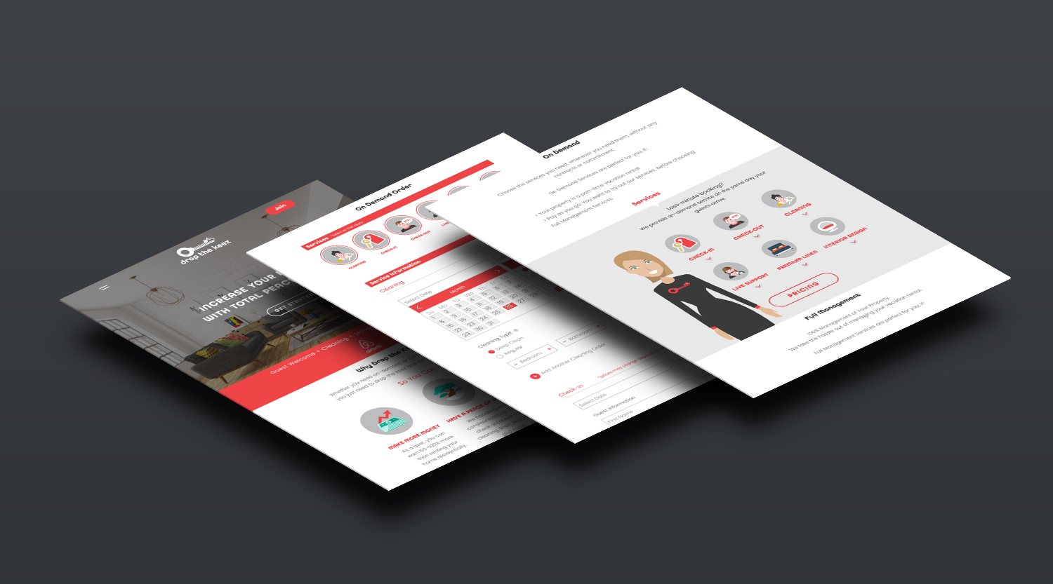
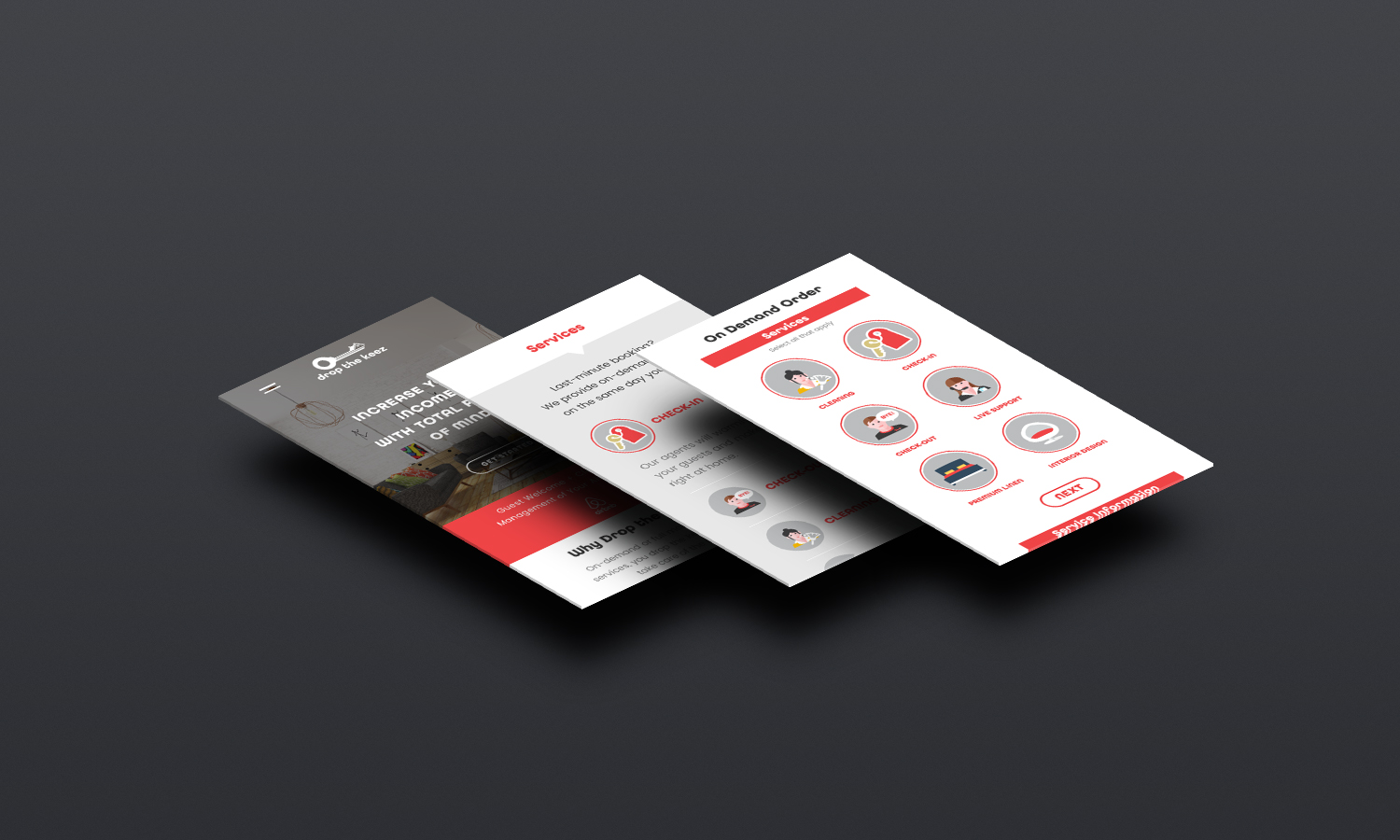
services
In order to make it easier for users to browse through the services covered under each plan, I chose to design a side by side comparison preview of each plan; each side leading to its respective booking page. I include a combination of text and icons in this section and throughout the website. This design decision provided visually familiar elements that emphasized the brand's friendly persona, enhanced aesthetics, and improved the UX.

Booking
Perhaps, the most challenging design task on this project was designing booking and payment. My design strategy was to keep the booking experience look and feel easy and quick. Due to the high volume of information, required from the user, a one page, stacked form could have easily feel overwhelming and scare potential clients. Therefore, I decided to break down the form into four main steps. The required fields on each segment of the form would only appear after the previous section was complete. This design decision proved successful when we tested it against two other design formats, including a simple stacked form.

mobile


the impact
My clients at Drop the Keez reported higher user engagement, a drastically lower bounce rate on mobile, and increase in overall bookings, due to the implementation of the online booking system.